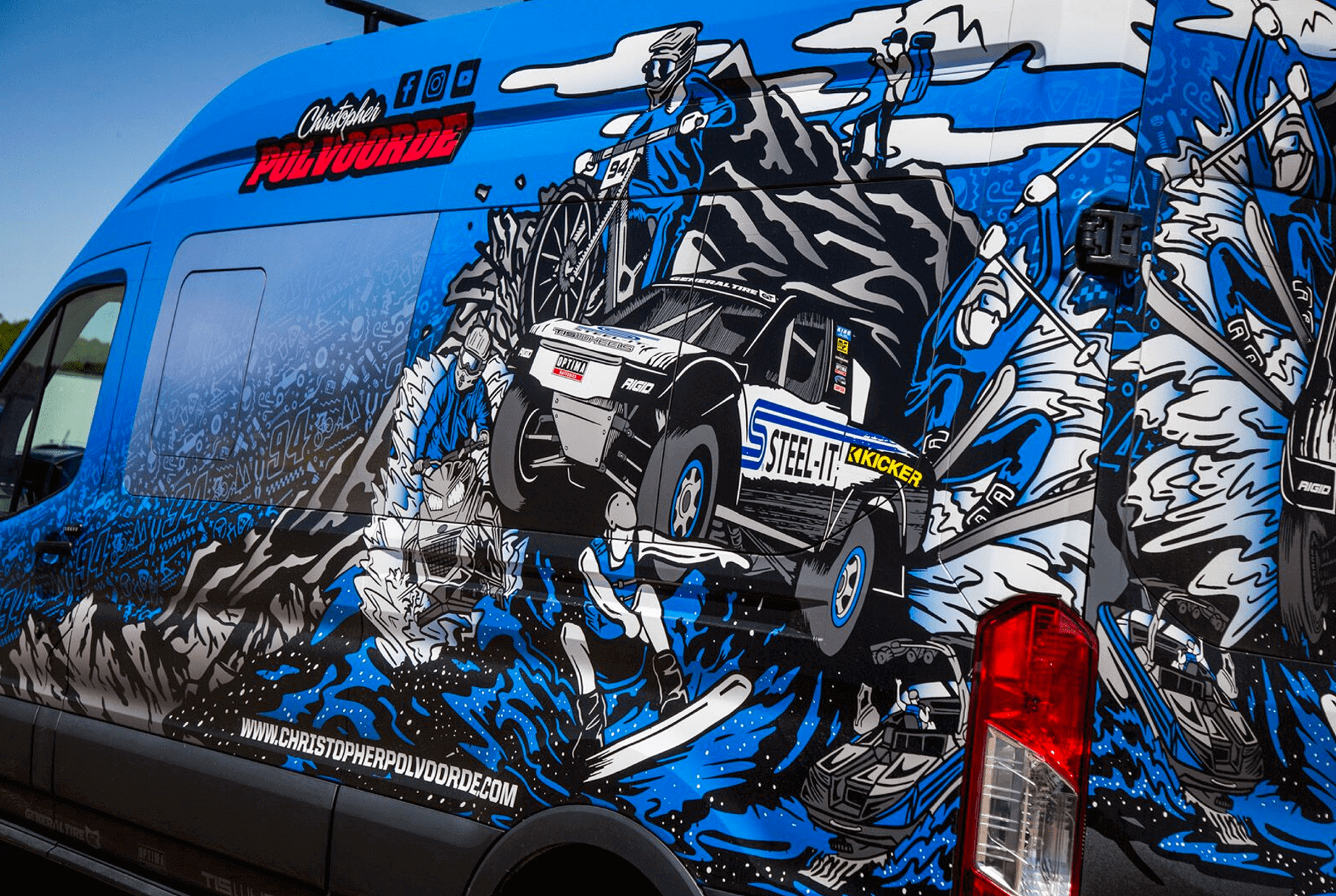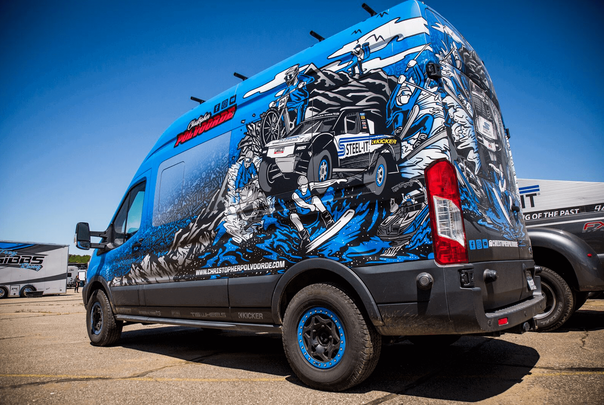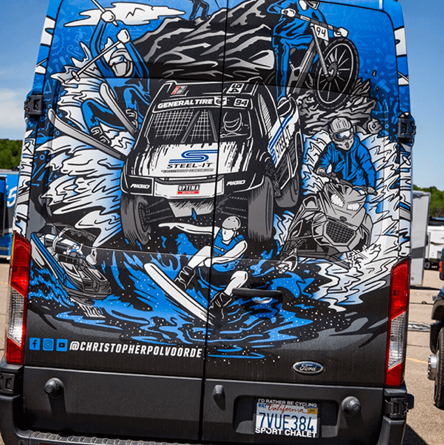


Christopher Polvoorde was born on July 28th, 2000 and raised in the Racing mecca of Southern, CA. From a young age, Christopher had an adventurous spirit and a passion for the outdoors and racing. That passion leads Christopher’s life to this day where you can find him chasing sunsets year around on the hills of Mammoth Mt or the waters of the Colorado River.
Project: Vehicle Graphic / Sticker Design
Categeory: Branding
Software Used: Adobe Illustrator
Like our work? Get started today email info@binkdesign.com for information
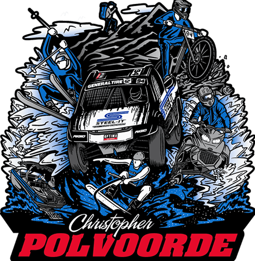
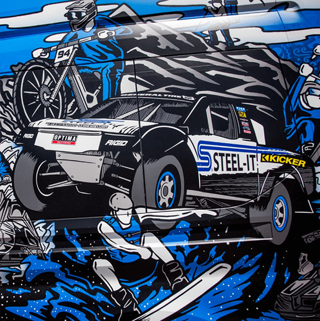
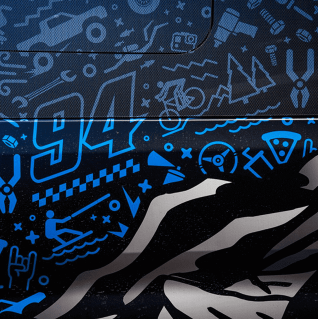
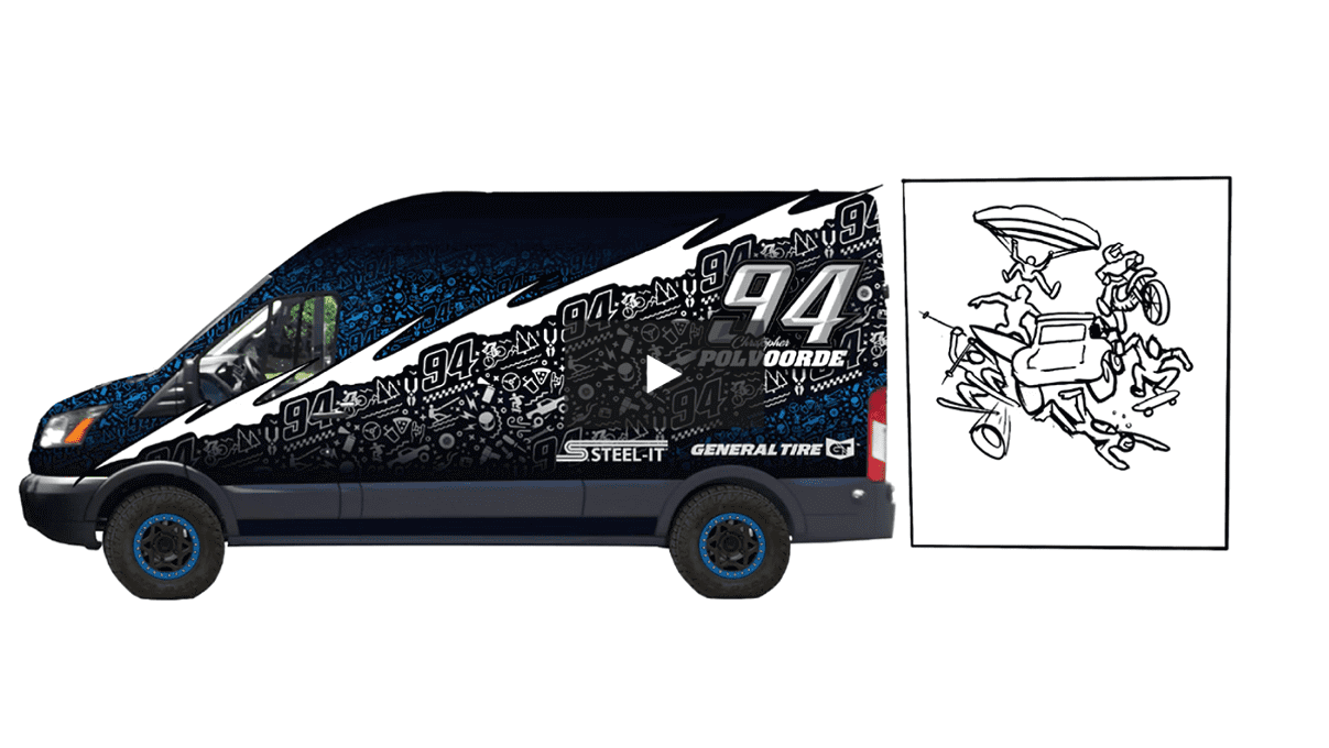
The idea behind this sticker is to create soemthing the Chistopher Polvoorde could use as a sticker as well as an awesome wrap to show case all of his interests hobbies and what makes Chistopher, Chistopher.
Overall the design came out exactly to what we was looking for. Showcasing his STEEL-IT truck as well as everything else Chistopher loves and enjoys.


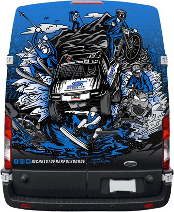 BACK PROFILE
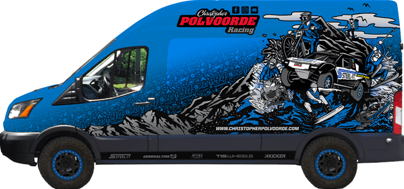 SIDE PROFILE
ABCDEFGHIJKLMNOPQRSTUVWXYZ
abcdefghijklmnopqrstuvwxyz
0123456789
City is a slab serif typeface designed by Georg Trump and released around 1930 by the Berthold type foundry in Berlin, Germany.[a] Though classified as a slab serif, City displays a strong modernist influence in its geometric structure of right angles and opposing round corners. The typeface takes inspiration from the machine age, and industry. A consistent application of repeated parts: an outer circle softening interior rectilinear spaces, results in a highly unified and refined typeface.
The lowercase a is composed of a two horizontal rectangles in the interior, the outer skin follows the counter but always contrasting the outer stroke with the organic curves. The face was produced in three weights: light, medium, and bold, each in roman and italic. The graphic designer Jan Tschichold helped to popularize the City typeface by his use of it for his book Typographische Gestaltung published by the Basel publishing house Benno Schwabe & Co.
